Tag: lighting

Pre KickStarter Plans, Planet 2 Terrain, More Cloud Tweaks

KickStarter

Had a chat with some developer friends last night about my pre-KickStarter plans. The biggest hurdle, I feel, is getting a decent audience prior to launching the KS, so that I can get the important initial momentum.

Have also spoken with some PR/Marketing people briefly, and this is what I’m thinking:

  1. Consult with a PR agency, perhaps focusing on audience building and planning leading up to a KS campaign. I’m told you can often do hourly consulting calls, so I’d hand them my plans + questions on audience building. I’d love to have someone on board full time for a few months, but that is bank balance breaking right now.
  2. Do a trailer
  3. Build an audience using magical PR advice + trailer
  4. Get some professional feedback on my completed KickStarter page prior to launching
  5. Launch successful KS (it’s that easy)
  6. Use KS money for a variety of things from paying myself, to getting musicians, writers, concept artists, etc.

So I really just need to send some emails and see if some of these recommended PR people are available to work with me.

Task Planning

  • PR emails. I’m sure I’ll obsess over these a while :P 1 hour.
  • Clouds tweaking. Pretty important, 1 hr.
  • Planet 2. 4 hrs.
    • Spend a little more time getting the clouds more “readable”. I think they just need to look a little more…clear. I’ll try and define my thoughts below
    • Planet 2 geometry, replacing the placeholder generic stuff with something unique and fun.

PR/Audience Building Thoughts

The reason I’m getting in touch with some PR people is all my tweets, animated gifs, blog posts, teaser videos have amounted to only a tiny following. I need 10x my current numbers at least, pre-KS.  Maybe when I share a build with press, and they start writing about it, plus I release the ‘main trailer’, I’ll suddenly gain tons of followers? Some PR consults will hopefully ease my mind a bit/confirm some of these thoughts, and give me some ideas for how to build that audience, among other things.

Actually perhaps instead of some direct emails to these PR people, I might go in a slightly round-about route of emailing some of these people’s clients, and ask what they thought first.

I’m also punching in all the listed games to check their sales on Steamspy and trying to get a feel for how well they’ve done. Hopefully, I’ll get some emails back from the developers, as it seems like a really wide range of success levels for these games.

Took 2 hours researching these people and researching/emailing their clients.

Getting Distracted

Spending too long braching off reading PR/Marketing articles. Spent maybe an hour doing this, whoops.

Planet 2 Clouds

Somehow it’s 4pm already and I’ve done pretty much nothing :/ A few more distractions today too.

Ok, clouds. They’re decent right now, but I’m going to Move Sliders TM and:

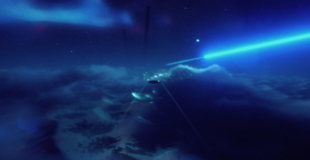
  • Get a bit more depth (try tweaking cloud extinction/contrast) and perhaps just cloud height
  • Tweak edge noise settings so it looks nicer when we are right inside clouds. Changing trueSky’s unit/scale might help here too.
  • One of the least realistic looking things is how the clouds don’t appear to be affected by the terrain below them at all. This might be nigh on impossible to change, but I may also be able to cheat it a bit by maybe
    • increasing ‘churn’ of clouds
    • lowering clouds right onto the ground and increasing their height so you can’t tell as easily
    • make them more see-through(?)
  • Right now the clouds are possibly also too ‘constant’ and I’d like there to be more variation so there’s peroids of more and less clouds
  • Maybe a little more ‘distinct cloud formations’ which the player can recognise as they follow the clouds (to give more of a sense of where we are).

Progress:

Since turning lightning off I realise how broken my code is which auto-transforms us back into a glider if we are holding shift when entering clouds… Need to look at this soon-ish.

  • Changed the sky units, so it’s effectively scaled down but more detailed.
  • Can’t diffuse the clouds too much, leads to uncertainty as to whether we are actually in a cloud
  • Softened cloud edges (better looking close up)
  • Raised clouds off terrain a little so they didn’t look as odd not being affected by it
  • Reduced cloud density (less clouds, more open space)
  • Looking better in most ways, a little worse (legibility at certain angles) in others:

EXOONE-Planet2

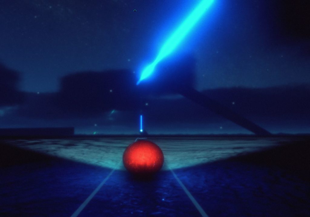
  • Might remove certain monoliths that occasionally clash compositionally. Esp now with the reduced thickness/low altitude cloud.
  • Going to call this good enough for now and try not to fiddle with it for many more hours.

1 hour

Quick Look at Gliding in Clouds Bug

While hardly noticeable in the last planet, it’s very annoying now, need to check this out.

Solution, EXO ONE wasn’t gaining enough energy to replace cost of gliding! 15 mins.

Removed a Couple Offensive Monoliths

And their compositionally breaking lines!

5 mins

Short Detour…

Realised I had overwritten my first planets terrain data with the new one, oops. Got it back pretty quick though, 15 mins.

More Detouring

I’m not quite sticking to plans here… Now messing with camera settings, because at night, the lens flares and stuff can look really overwhelming!! 20 mins

Planet 2 Terrain

Having some odd issues right now getting a simple 1 biome terrain working with Map Magic. Must be cos it’s late…! 30 mins.

Going to setup a screenshot for Made With Unity Friday and schedule that to go out, because it’s almost midnight. Will pick up the terrain again on Monday.

Whoring Up Some New Pluginzz!

uNature and Amplify’s screen space shadows look interesting! Might have a play :) Have a good weekend!

Fin!
Planet 2 Planning and Initial Tests

Planned Tasks:

  • Follow up on some emails for Hyperfocal Design + some back end “coding” 30 mins
  • Writing up some notes on a friends game currently in development 60 mins
  • Planet 2 Planning. What will the geometry look like and handle like for gameplay, what will the colors/lighting be like, etc. 2 hours
  • Initial Planet 2 test geometry/lighting/color. 4 hours.

Hyperfocal + Emails

Took a little longer than expected, 2 hrs total.

Planet 2

If I had the budget, team, time etc I’d probably get a bunch of concept art drawn up per-planet, but I don’t, so I’ll focus on assembling a bunch of art and photos that somewhat capture the look I’m going for.

Here’s what I’m after, considering Planet 1 is mostly ‘nice looking’, bright, warm:

  • General theme is still somewhat ‘nice’, welcoming, but cooler and more alien than planet 1.
  • No sun, night time, visible night sky with intense, nearby nebulae, which lights the terrain below in a combination of red/blue/green.
  • Harsher shadows, lit by EXO ONE’s light
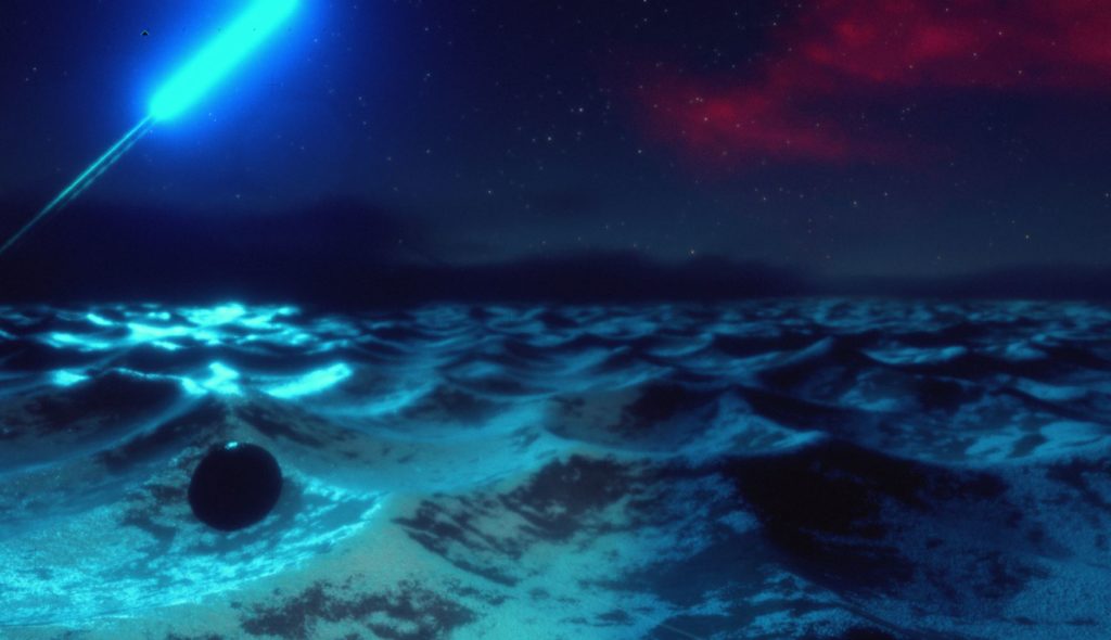
  • I’d like an almost snap-frozen ocean look, but am thinking this may be quite a lofty goal. Perhaps a moon-like surface as a backup plan… Since I’m kinda lacking time and resources, I’ll be doing this a bit. Can I get good, fast results? If not, abandon and move on, maybe return later :)
  • As an object/flora theme I might try placing a lot of icicle/ice mushroom covered objects, which would have the added benefit of being easily repeatable.

Gameplay wise:

  • Similar to first planet, with variations on geometry, mostly pushing more of the voronoi patterns than flowing hills. If I can get them looking anything like waves I’ll go with that. Otherwise it’s moon surface!
  • Lower clouds, possibly touching the ground (will test!) therefore less height but more speed
  • Fast moving clouds moving in opposite direction to goal(?) Play with having to move from cloud to cloud, or avoid them. Former makes more sense considering planet 1 gameplay. One planet may require the player to stay low/behind hills… could be this one.
  • TBD whether we need more aerial gameplay.

Here’s the Pinterest board I made for “Planet 2”:

https://uk.pinterest.com/jayweston/exo-one-planet-2/

1hr

WIP

  • Initial new scene creation – cloned Sagan4 and renamed some things. I feel like this is a terrible way to do it but don’t really know any other way! I think if I ever accidentally apply prefab changes to something I shouldn’t, I can potentially stuff things up across multiple planets… Doing prefabs for every planet seems crap too, because if I want to change something for all planets, the changes aren’t made everywhere… Thoughts??
  • Putting some placeholder terrain in, then setting trueSky to night time.

wipPlanet2

  • The tough thing here might be generally making a great looking nebulae skybox… I’m going to look at how trueSky’s is done.
  • I’ll be replacing trueSky’s lighting with my own to simulate the light of nearby nebulae hitting the planet.
  • Pasted in a nebulae from my reference quickly to check out the quality level etc. It’s pretty low for a 4096… probably not worth trying to do any detail apart from large scale color variations.
    • Could explore other options such as high res nebulae billboards in the sky, but for now I think I’ll go for the in-built, mostly easier method.
  • Just from this test it’s now super obvious I should keep the red tones lower, otherwise I quickly return to a ‘sunset looking’ color scheme similar to the first planet.
  • I’m trying to use trueSky’s moon to give the clouds a bit of lighting from the nebulae, but unfortunately the higher I set the moon lighting, the duller the skybox gets (due to camera exposure)
    • Reducing the atmospheric brightness fixes this issue
  • Differentiating visually what is nebulae and what is cloud seems harder than I’d thought! But haven’t spent long yet on this. It’s just going to be tricky if I want to use a ‘low res/color wash’ style nebulae. This is made harder too when I’m wanting to use a foggy, low cloud layer. They both look quite similar. Not even worth showing!
  • This part of development just always seems to take me ages moving sliders. Can’t get away from it I suppose… It’s fun and I enjoy it but it takes ages figuring out good settings.
  • I’m now trying a more ‘iconic’ looking nebulae, rather than ‘a bunch o nebulae clouds’. So it’s obviously not terrestrial cloud… Thing is… All nebula is cloudy up close :P
  • Here’s the sorta detail level we get from a sharp 4096, 16bit skybox:

wipPlanet2Nebula1

Not great! I’m just currently slapping in high res NASA nebula to see what looks good or not! Starting to wonder if I’m going to have to bail on the skybox idea.

Breaking for dinner. That took me about 2 hrs of playing around.

More Nebulae

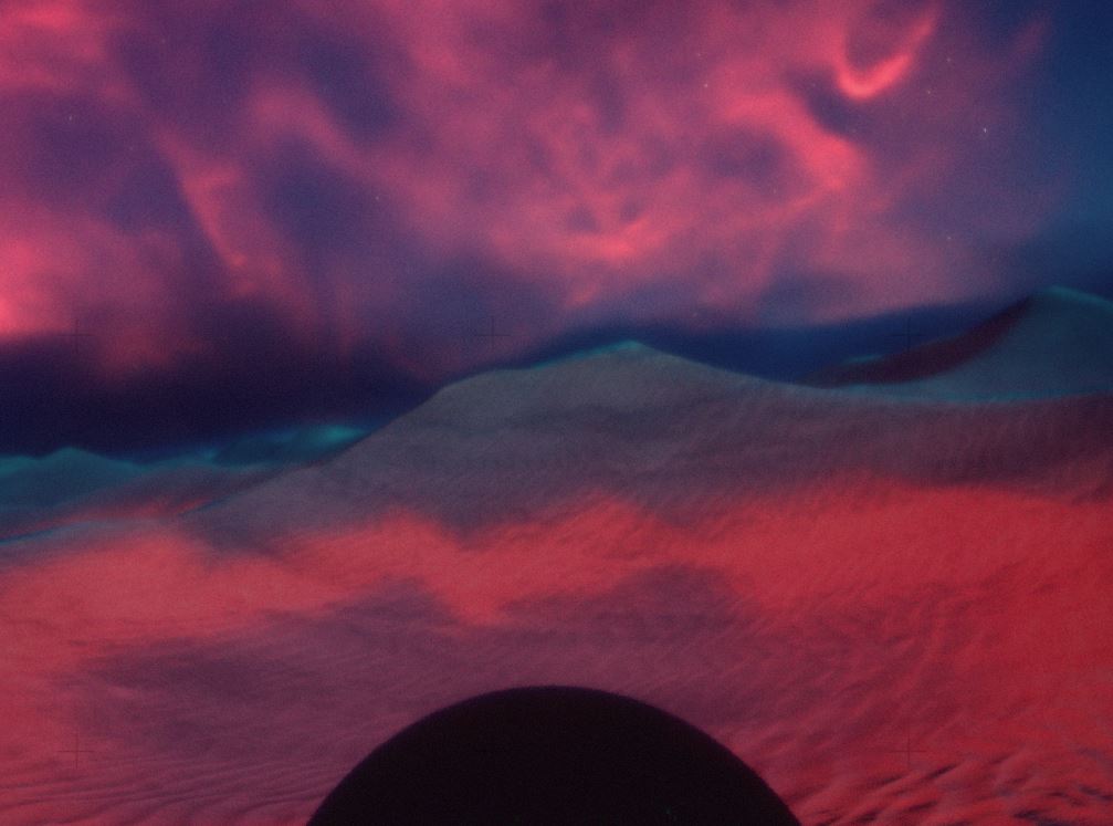
Again the Nebula for some reason just seems to look like red clouds in the sky. Unsure why. Perhaps because so often when we see nebula they are very finely detailed? Or it’s the Milky Way, which is super faint to the naked eye. I could also just be pushing the color too hard…

wipPlanet2Nebula2

I’ll sleep on it!

Tomorrow, Per Planet Ambient

There is no light color coming down from the red nebula, so tomorrow I might either play with some reflection probes or per-planet ambient settings, so I can add in some red/pink light (using the above screen for example). Will help give it that colorful red/blue effect I’m after.

Bye-bye!

© 2024 Exbleative

Theme by Anders NorenUp ↑